Ateliê da Jú


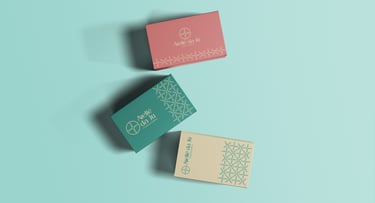
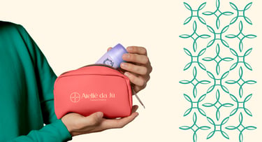
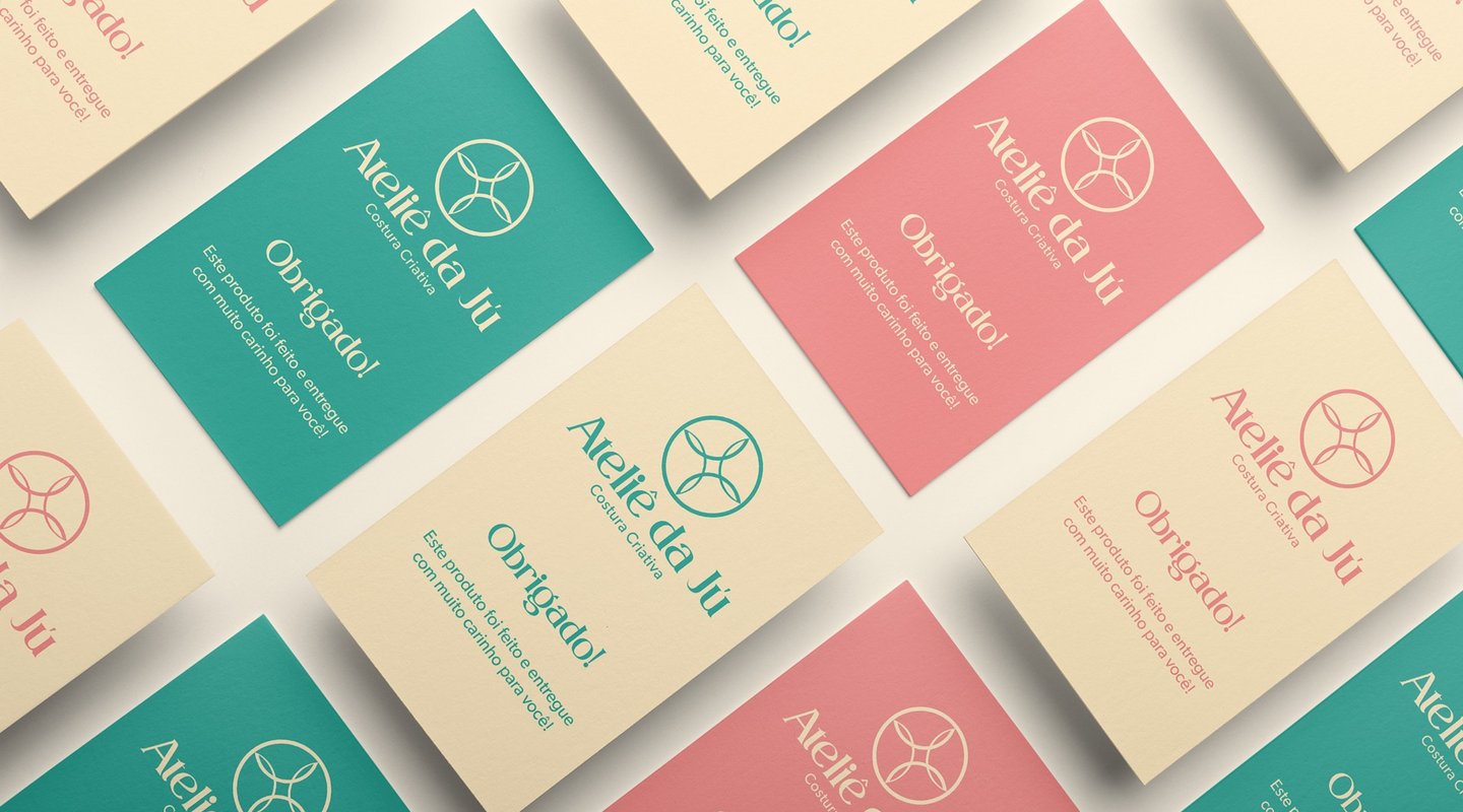
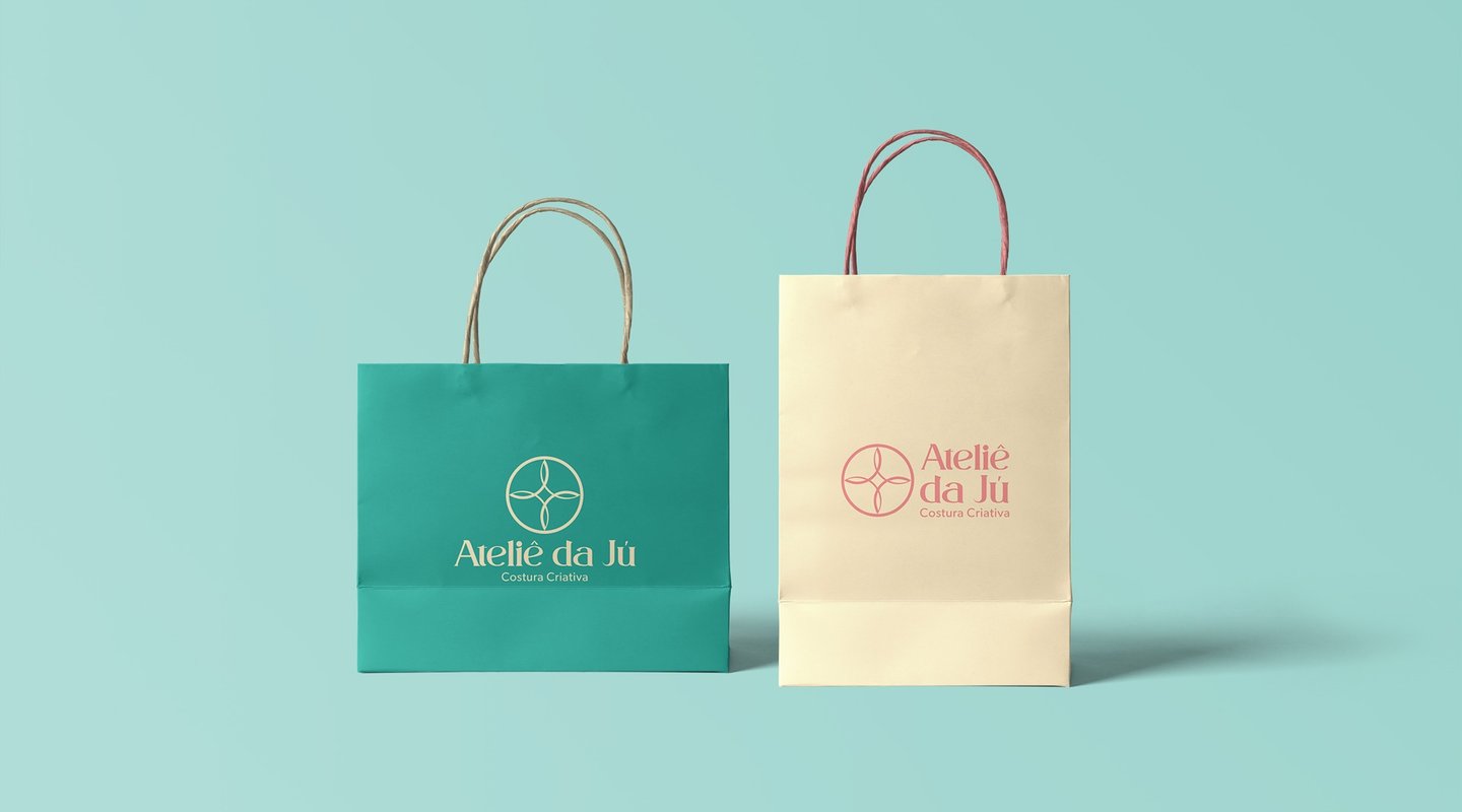
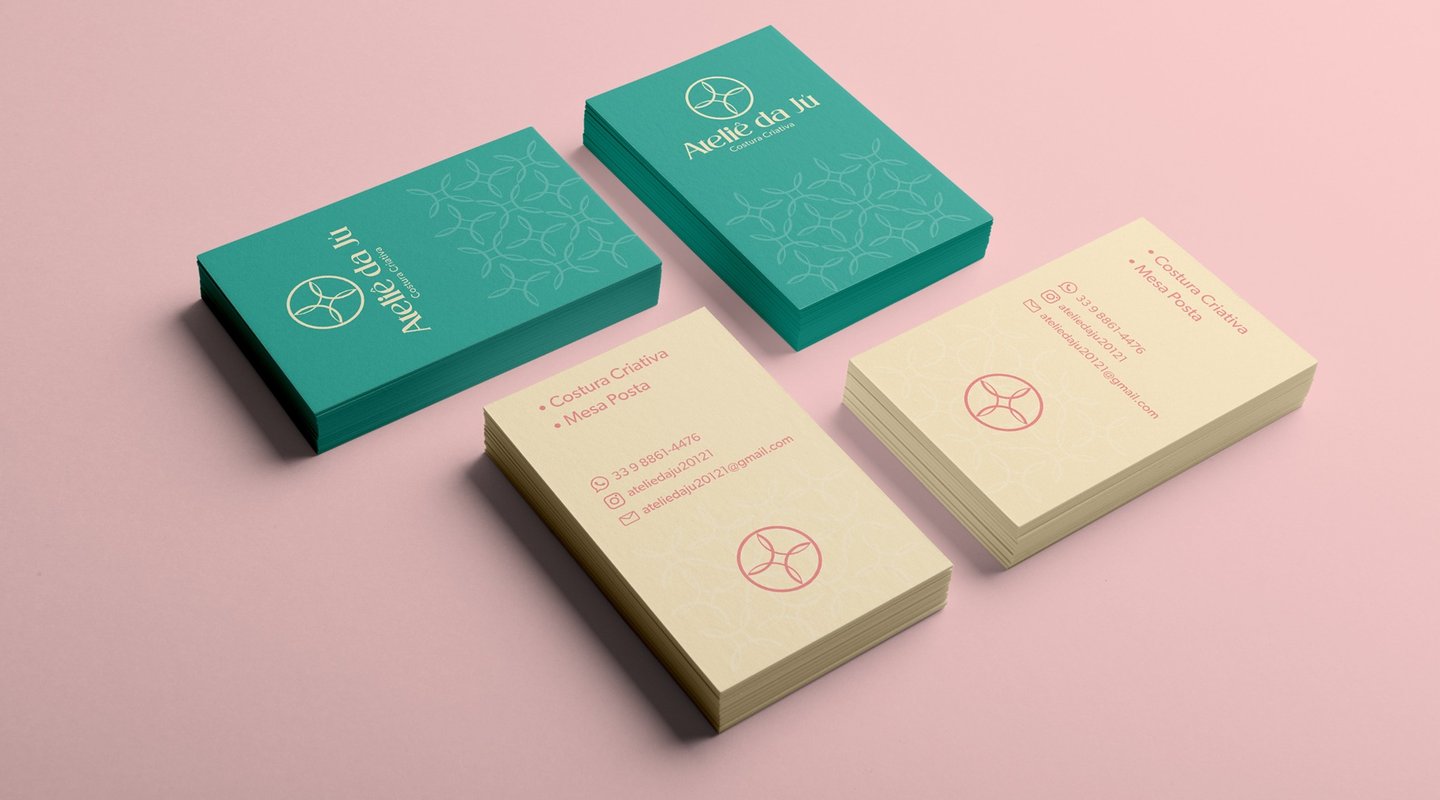
Desenvolvemos uma identidade visual para o Ateliê da Jú de acordo com suas características pessoais e de marca. Criamos elementos visuais de fácil comunicação com o seu público, facilitando a conexão entre eles e mantendo um padrão sofisticado e com design inovador. A marca deve transmitir elegância, profissionalismo, e ao mesmo tempo ser alegre e extrovertida.
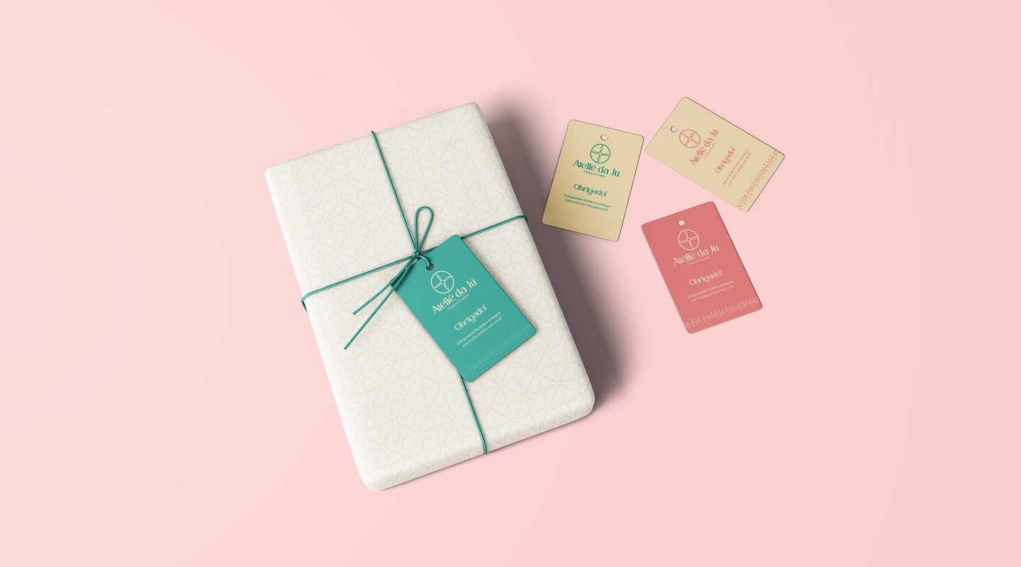

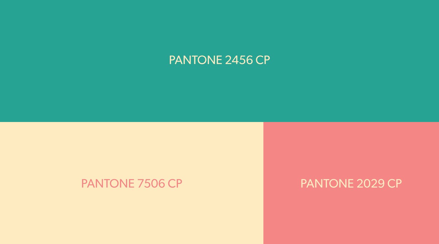


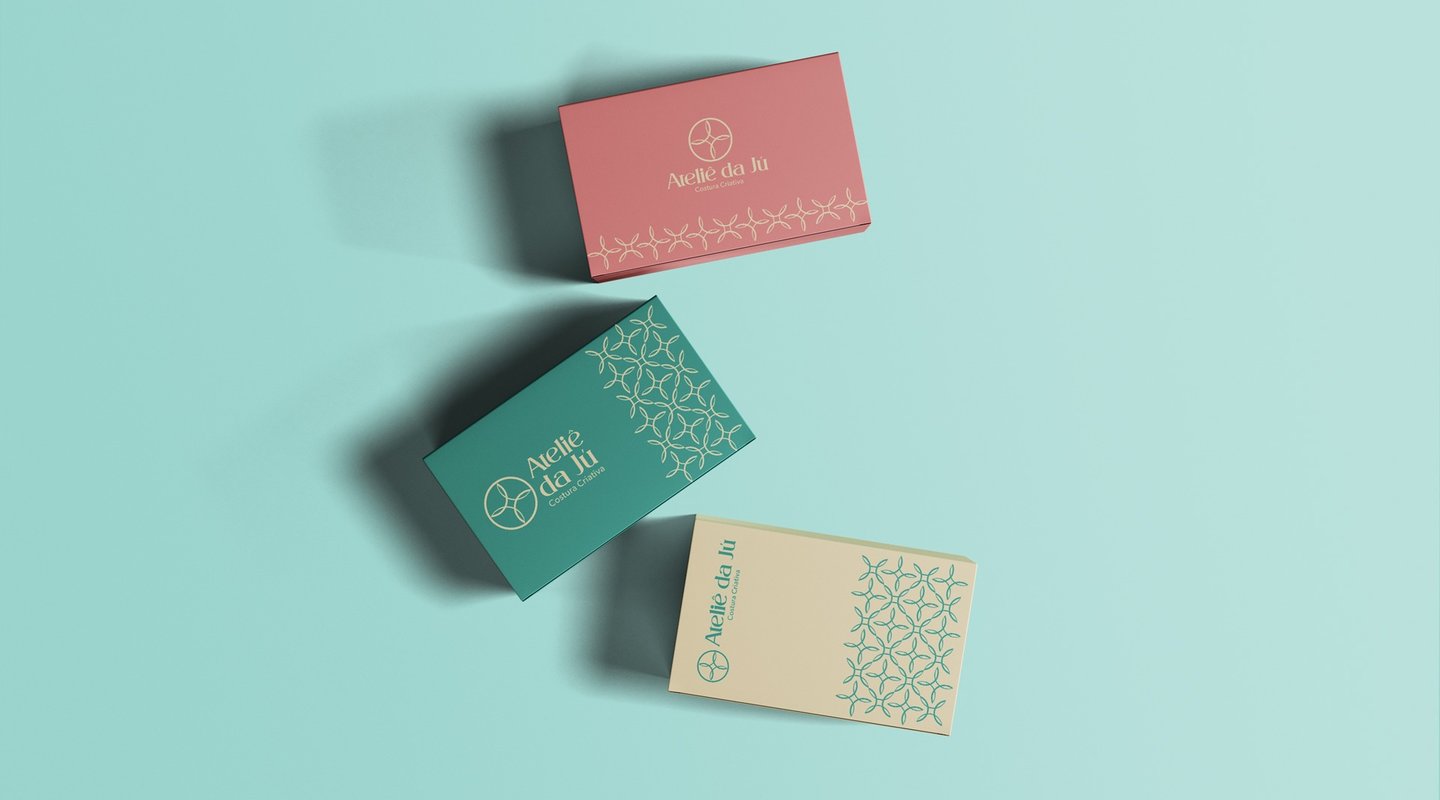
The choice of colors was based on the idea of conveying lightness and elegance, yet still being outgoing and cheerful.
Green was chosen for its calm and positive properties, while the pastel shade was selected to create a cleaner and more cheerful visual.
Yellow was used for its optimistic and joyful nature, in addition to providing excellent contrast with green, facilitating the application of the brand on different backgrounds and versions.
Pink, chosen as a complementary color, represents beauty, love, and sensitivity. It is used in a pastel tone, like the other colors, to maintain a clean and cheerful visual ideal for the brand.
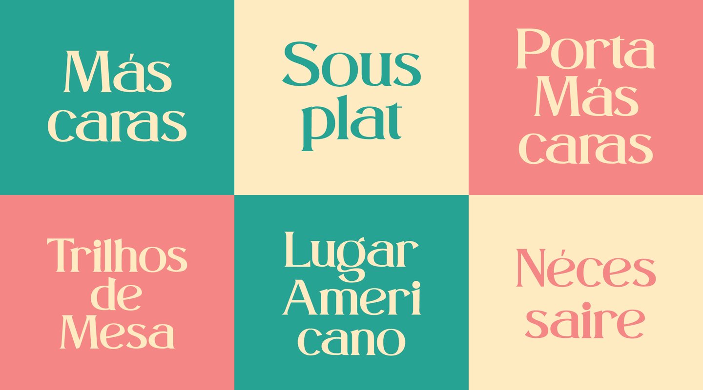
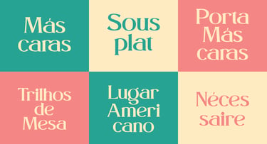
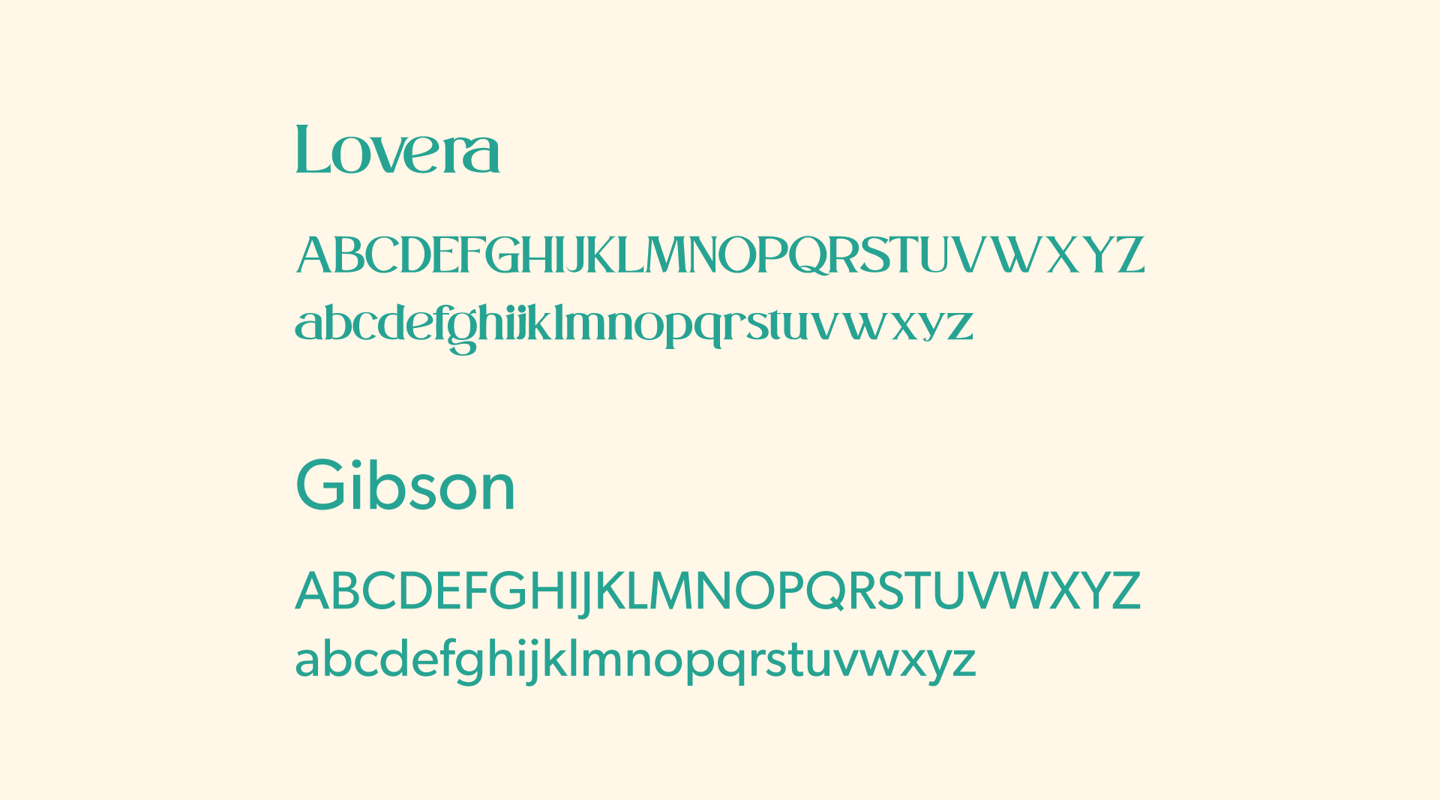
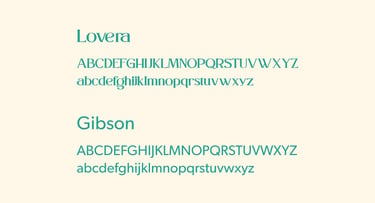
The choice of Lovera as the main font was based on its vintage appearance, which still manages to be clean and maintain a modern, cheerful, and dynamic aspect, making it visually appealing.
On the other hand, Gibson was used as a supporting font for its more subdued look and a wide range of variations, allowing its use in internet texts or graphic materials.
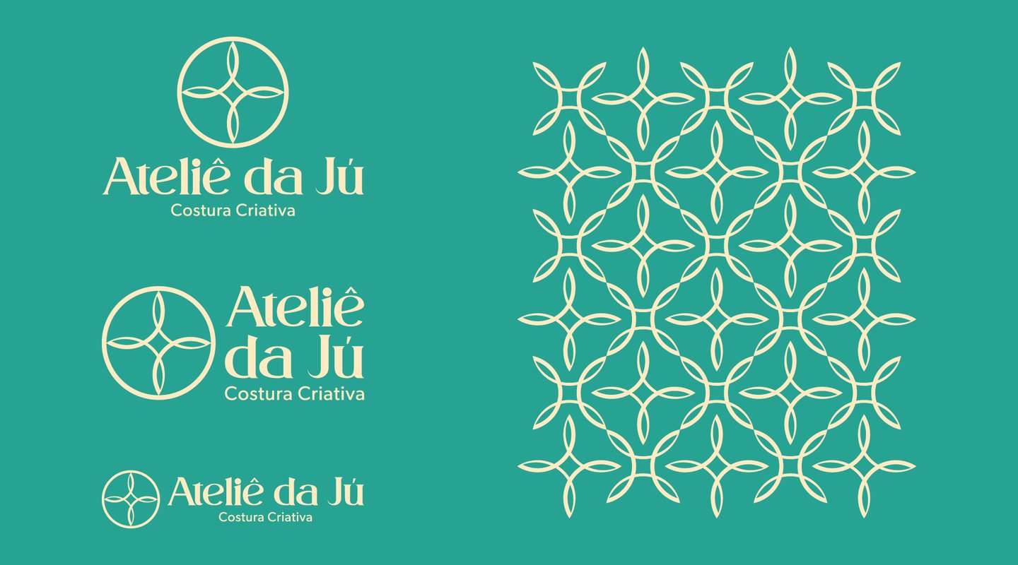
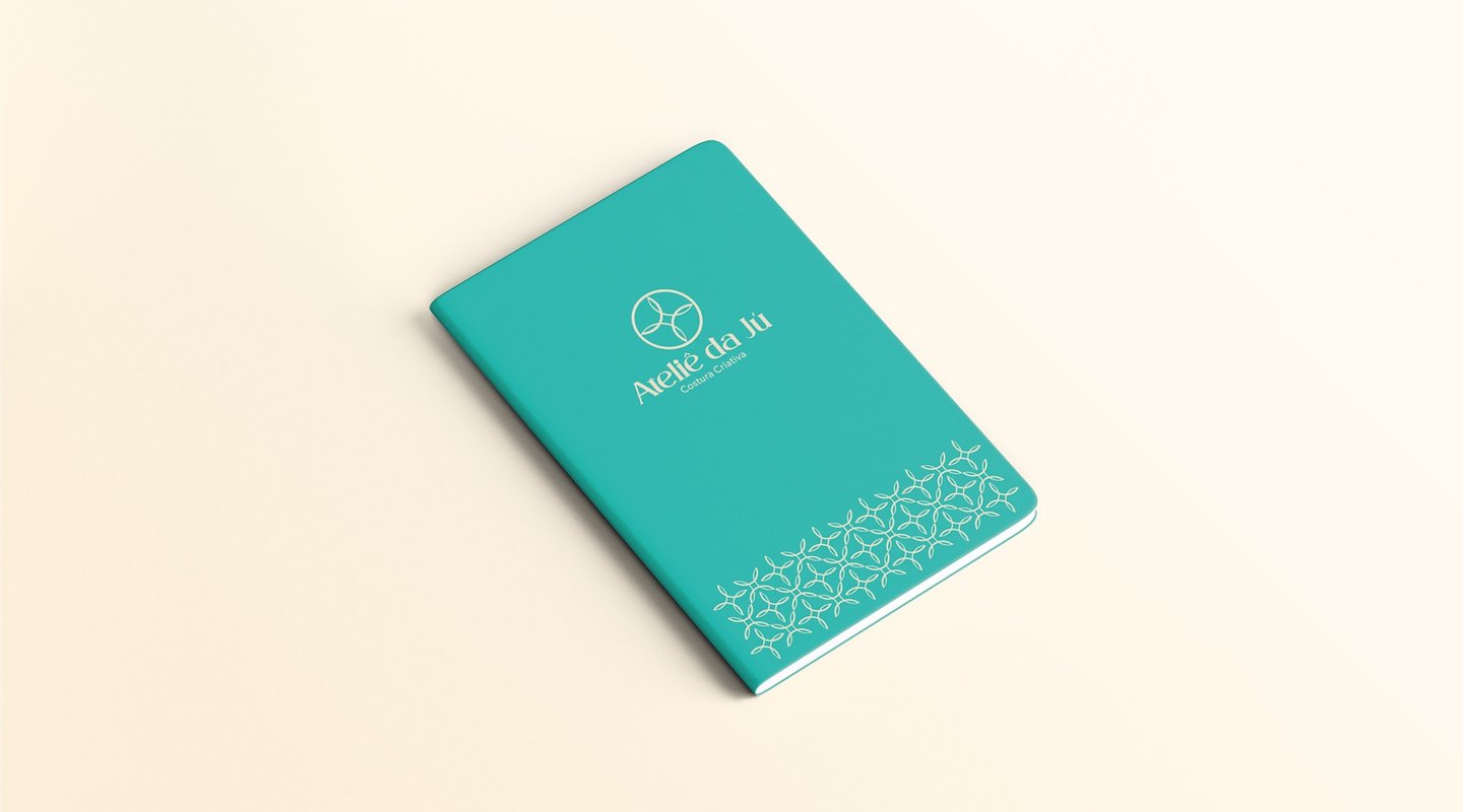
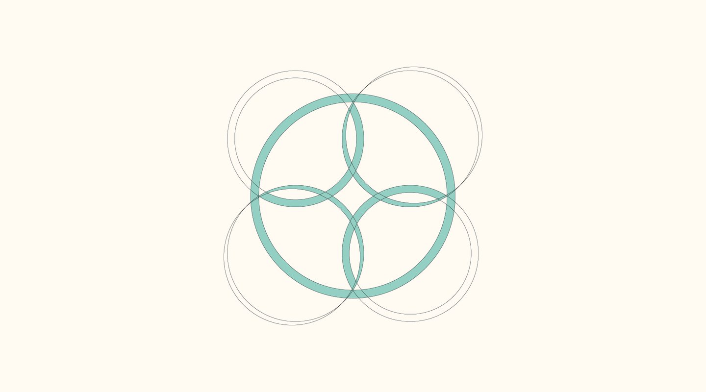
We opted for the bold choice of developing an abstract symbol that would be exclusive to the atelier.
The decision was based on the briefing and several conversations with Juliana, where the preference for a symbol without hidden meanings became evident, but rather one where the meaning itself would become synonymous with Ateliê da Jú.
We sought a design that could be minimalist, allowing its application in any necessary form without losing sophistication while conveying lightness at the same time.

